Our Process
Data
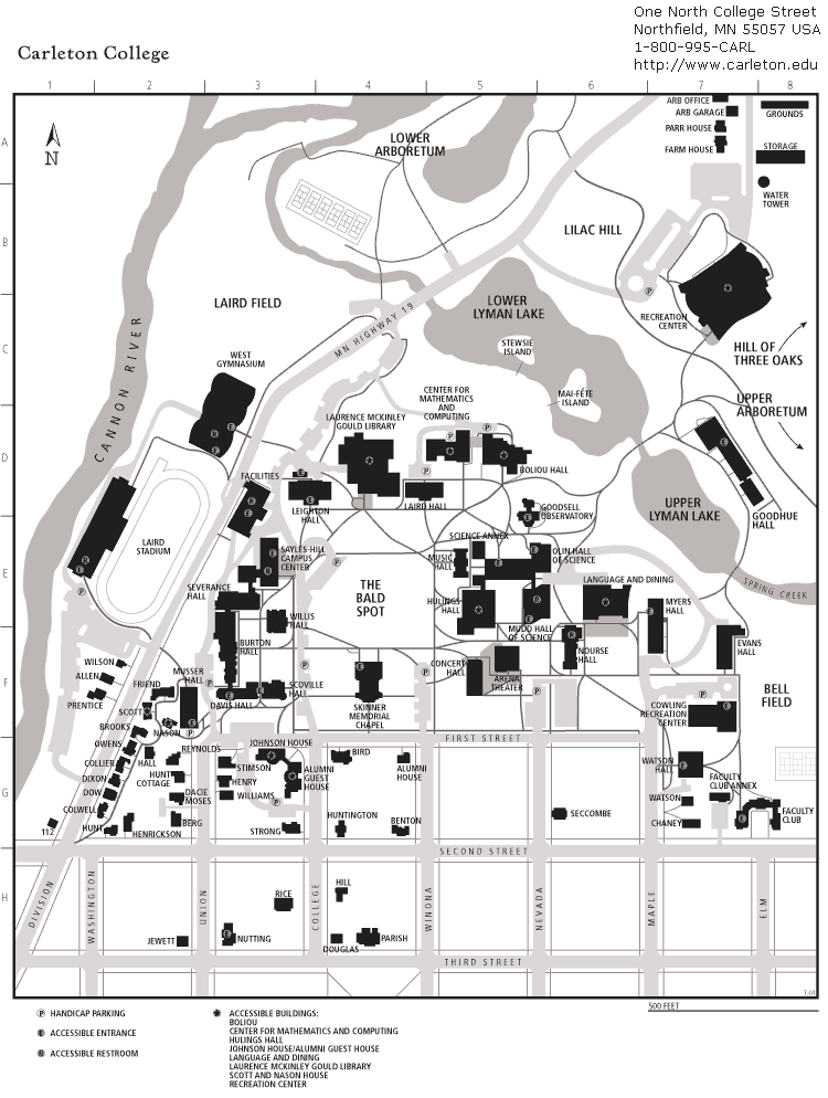
Data on Carleton College’s past and current campus supported the creation of our interactive web map and 3D models. The majority of our data comes directly from Carleton College and does not include sensitive information. Our interactive web map was built using two historical maps of Carleton College’s campus, both sourced from the Carleton College website. The first map represents the campus predates 2008 which we determine due to the absence of Cassat and James Hall. The second map is a current campus map from the fall of 2024, which includes new additions such as the Lilac Hill buildings, the Multicultural Center, and the Black Student Center. The official Carleton Website aided much of our collection of the metadata, including dates and descriptions, while the exact coordinates were gathered from Google Maps.

For the 3D models of Henry House and the Music and Drama Center, stock images and floor plans were especially useful in creating renditions of the two now-demolished buildings. In the circumstances where images of the buildings from certain sides were unavailable, Google Earth allowed us to view street views of the structures.

Methods
To create the interactive web map in ArcGIS, we began by georeferencing the two maps of Carleton’s campus, pre-2008 and current, using OldMaps. After navigating the challenges of attaining the XYZ links, we uploaded the georeferenced campus maps into ArcGIS as new layers. Then we compiled the data we gathered into a Google Sheet. The data included location name, function, year built, year demolished, status, address, coordinates, and a brief description. This metadata was then downloaded as a CSV and uploaded into ArcGIS. For the map interface, we edited the symbology, labels, and transparency of the maps, as well as added pop-ups and area features. Once our web map was created, we embedded it into our story map where users can navigate the campus and observe how certain buildings have been added, removed, or repurposed over the years. The 3D models were created in Fusion 360.

Presentation
For the presentation of our interactive web map, we made several design choices to improve data comprehension and enhance the experience of the user. To begin with, we chose to have each building, new or demolished, to have a unique symbol based on its functionality. The buildings we included were put into four categories: academic, residential, community, and performance center. Of these four categories, each has a designated and consistent symbol to aid user recognition.
We then developed a feature layer that outlines each building’s shape on the map. This allows users to differentiate between structures not focused on in our project. Additionally, we added labels to make the building names stand out, alongside custom pop-ups. These interactive popups present the metadata in a clean and navigable interface. Each building is represented as a clickable point, and when selected, a pop-up appears with additional metadata, including the year the building was constructed or demolished, its function, address, and a brief description. Lastly, we adjusted the transparency of the current Carleton College map to reduce visible clutter.
DGAH 110 Final Project
Theme by Anders Norén